This is an old revision of the document!
Working with Hotspots
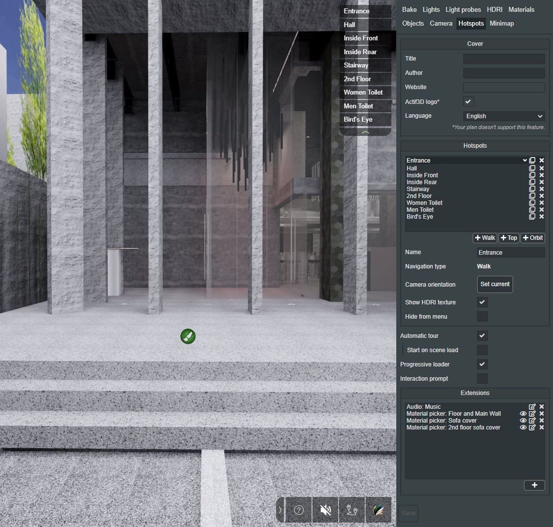
Hotspot is a point of interest with a predefined name. It helps to create views for navigating the scene in play mode. This list of views will also be available in the online viewer when you publish your scene.
The Hotspots tab allows you to create hotspot views in the scene and. It also allows you add interactions like material pickers, HTML pop-ups, links, or audio to the scene.
Cover
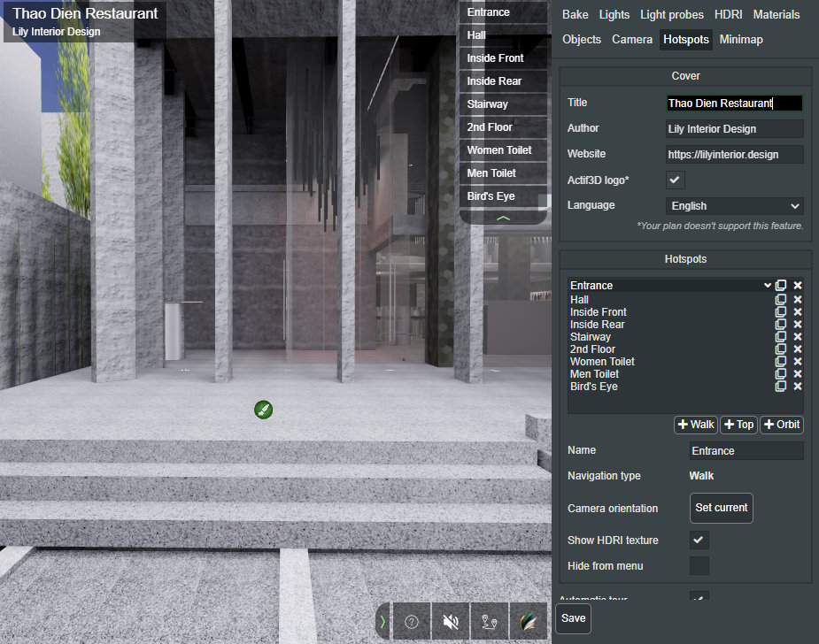
If you are not using a trial version or Beginner plan, you will see the Cover section in the Hotspots tab settings. These settings are used to create a cover displayed in the player.
Title
Sets the displayed project title.
Author Sets the displayed scene author name.
Scene_author.png
Author's logo URL (Custom branding) This is the URL that the custom logo is fetched from.
your_company_logo.png ❕ This setting applies only to this scene and takes precedence over the default Logo URL, which is set in the Actif3D Cloud settings.
custom_logo_a3d.png
Author website The site that is opened when the author text or logo is clicked in the viewer.
author_website.png
Actif3D logo (Custom branding) Toggles the visibility of the Actif3D logo.
hiding_a3d_logo.png
Views The Views list defines points of interest to which the user can automatically move by clicking the name of the view. The first view on the list is the initial camera position after the scene is loaded. Three types of views can be added:
➕ Walk button - Adds a first-person view in the current camera position. First-person views allow the scene to be explored from a walking human perspective and are most commonly used for interior scenes.
➕ Top button - Adds a top view in the current camera position. Top views allow a floor plan of the whole building to be shown with the camera oriented down. In some scenes, a double-sided ceiling can block the view of the floor; in such cases, the ceiling can be hidden in the Objects tab.
➕ Orbit button - Adds an orbit view in the current camera position. Orbit views allow rotation around the model and are useful for presenting building exteriors.
Once the view is added, it can be modified with the following controls:
Menu position ▲ and ▼ - Moves the selected view up and down on the list. Name - Sets the name of the view. Navigation - Displays the chosen navigation type (walk, top or orbit). Camera orientation - Set current - Sets the current camera orientation as the orientation applied when the view is selected. Hide from menu - Hides the view from the view menu (displayed in the top-right corner of the viewer). Disable panning - (orbit mode) disables camera panning with right mouse click. Angle limit - (orbit mode) limits range of view angles. Distance limit - (orbit and top mode) limits range of viewing distance
Automatic tour The Automatic tour option is available for scenes with more than one view. When enabled, the tour button is added to the bottom menu of the scene. The button starts a tour between all the views.
automatic_tour_button.png If the Start on scene load option is checked, the tour starts after the scene is loaded without any user interaction.
Progressive loader The Progressive loader option allows the user to interact with the scene before it is fully loaded. If enabled, the scene is displayed with basic colors as soon as the scene geometry is downloaded. The quality is then progressively improved as the scene textures and lightmaps are downloaded in the background.
❕ The progressive loader activates only when the loading time exceeds 30 seconds.
Interaction prompt The Interaction prompt option enables animated popup to inform that content has loaded and user is able to interact with the scene. Prompt is shown as soon as scene is ready to be displayed and is removed on first user input.
Extensions The Extensions panel allows the user to add interactions like material pickers, HTML pop-ups, links, or audio to the scene. It is documented in the “Extensions” article of the help center.

